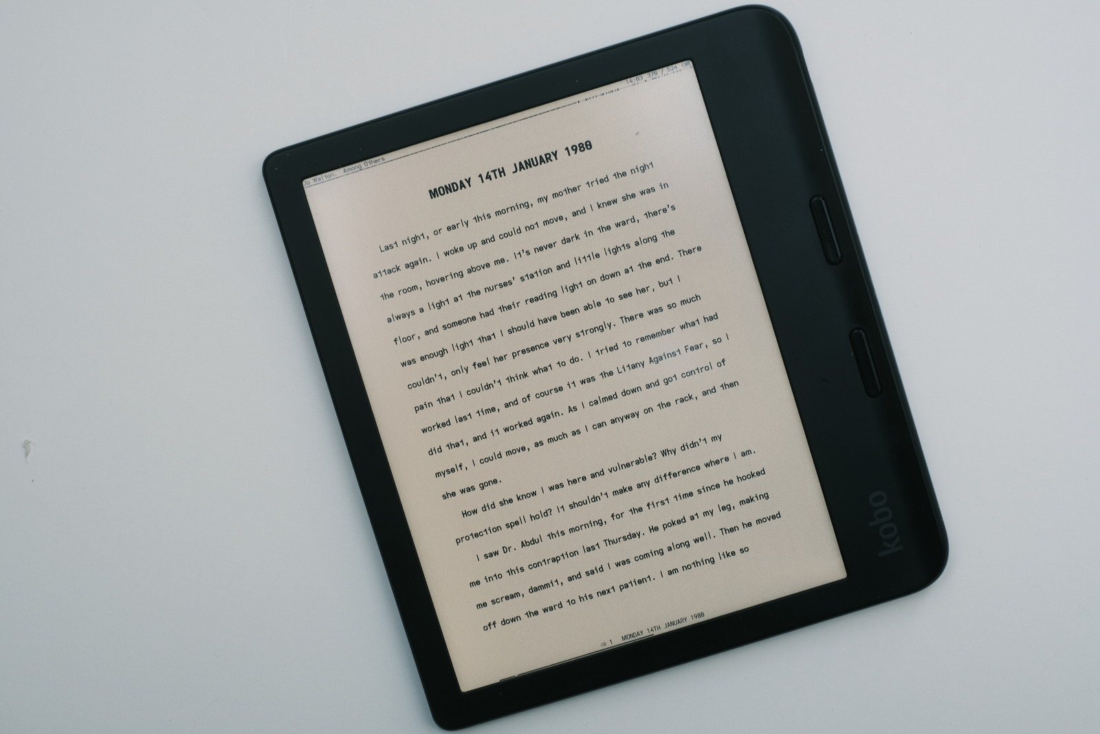
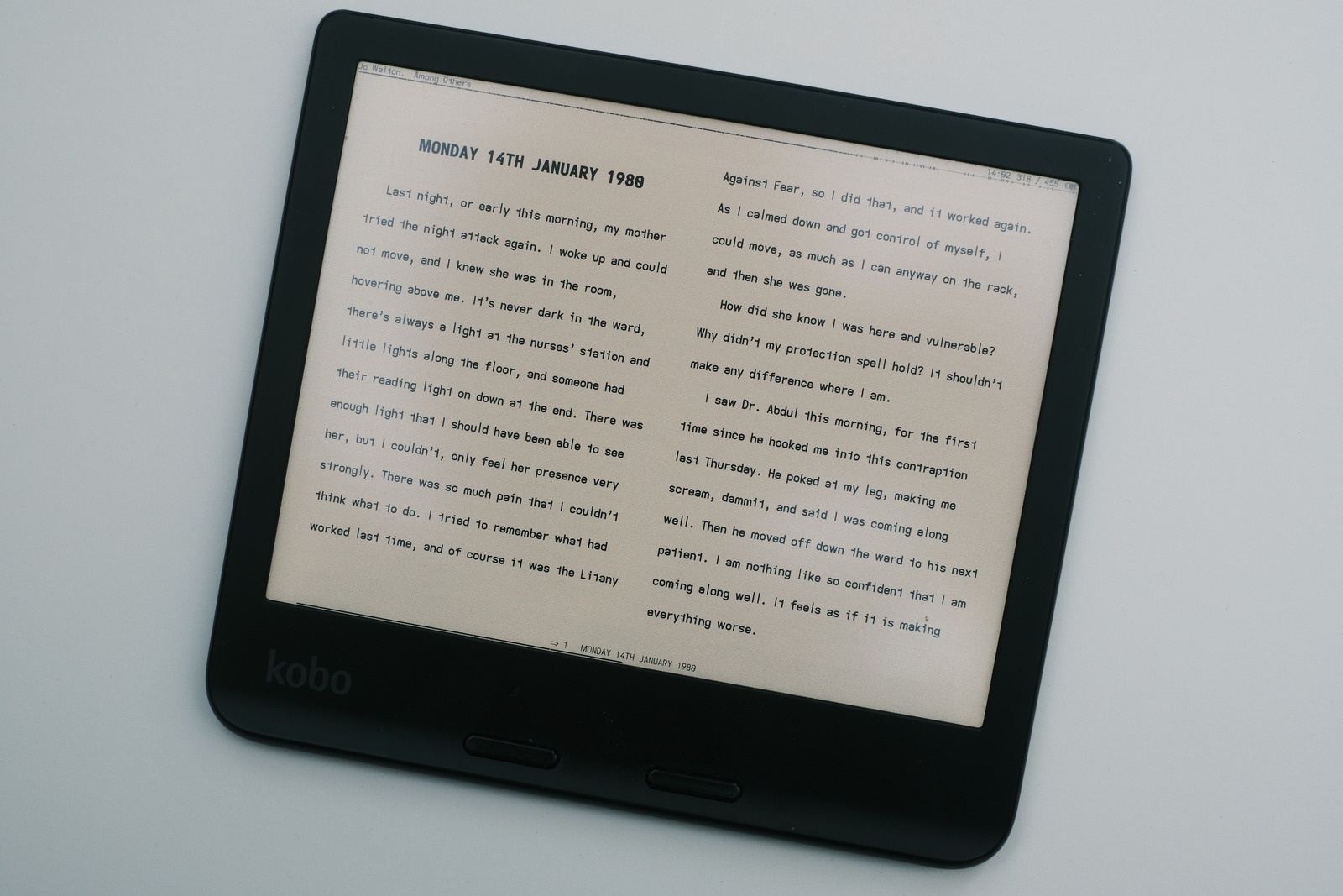
koreader settings
following grokking koreader are the settings—and importannly, their menu location—currently used on my Kobo Libre Colour. As much as anything, this document is meant as a record for rebuilding this custom configuration should it be necessary—useful because setting locations fade with time, as one achieves the desired “look”.
Along with my custom KOReader patches, i enforce a uniform page layout which provides a visually optimal personal reading experience. It is the result of countless setting iterations—often repeatedly trying new values only to return to the previous settings.
These settings provide a snapshot in time (now) and undoubtedly will change over time, as aging eyes dictating a new aesthetic—though, up till now, i have been blessed with eyesight which can resolve extremely small font sizes. Until then..
fonts
i set the draft font as my..
top > document > font > draft
long pressed to set as the default font. Custom patches set the header and footer text with this font.
Via gestures (and alternately, a batch script), the..
top > document > font > proof
is set to the proof font for the book font—proof differing from draft with its descending and extended glyph set (which is less suitable for the page header/footer imo).
Update: the default font for header/footer and body text is now updated to the newly released galley font.
For these particular custom fonts..
bottom > contrast > contrast (gamma) > 2.6
bottom > contrast > font weight > 1.50
When the font does not display as pure black text, insert..
top > document > book-specific tweat > * { color: #000000 !important; }
Easier still, create a css script with the above css snippet and place this in the koreader/styletweaks folder, which can then be toggle as required per ebook (which is exceedingly rare)..
top > document > user style tweaks > css script
layout
the following defaults are set:
The font size is set to..
bottom > font > font size > 11.5
Note: Font size ranges below 12 is possible with a user patch or by editing the settings.lua file manually.
As i use a monospaced font (tweaked)..
bottom > font > word spacing > large > scaling: 100, reduction: 100
portrait orientation

bottom > orientation > portrait rotation (0°)
bottom > orientation > two columns > off
bottom > document > line spacing > 235%
bottom > margins > l/r margins > left: 60, right: 60
bottom > margins > top margin > 28
bottom > margins > bottom margin > 24
tools > profiles > new with current book settings: portrait
tools > profiles > portrait > show in action list
Note: Line spacing above 200% is possible with a user patch or by editing the settings.lua file manually.
Note: Gesture assignments are used to facilitate switching between portrait and dual column landscape views. Using gestures to set the general profile and corresponding device orientation ensures a consistent reading format :)
2 column landscape orientation

bottom > orientation > landscape rotation (90°)
bottom > orientation > two columns > on
bottom > document > line spacing > 235%
bottom > margins > l/r margins > left: 25, right: 25
bottom > margins > top margin > 32
bottom > margins > bottom margin > 28
tools > profiles > new with current book settings: landscape
tools > profiles > landscape > show in action list
2 column portrait
or newspaper orientation..
bottom > orientation > portrait rotation (0°)
bottom > orientation > two columns > on
bottom > document > line spacing > 235%
bottom > margins > l/r margins > left: 20, right: 20
bottom > margins > top margin > 28
bottom > margins > bottom margin > 24
tools > profiles > new with current book settings: newspaper
tools > profiles > newspaper > show in action list
This has become my most recent used portrait orientation mode: the benefits of narrower eye scan focus combined with device holding button page turn convenience.
It took awhile to get used to the new line width—the eyes wanted to habitually move left to right—but once the visual distraction of the layout change faded, noticed the familiar reading speed boost the newspaper column format allows (achieving full line scans with just a vertical movement of the eyes).
It is a bit of a toss between the eye speed of the newspaper layout versus the familiar visual balance of the portrait layout.. KOReader’s “profiles” to the rescue to satisfy one’s reading mood :)
To enforce these settings over individual ebook publisher settings..
top > document > pages and margins > ignore publisher page margins
top > document > pages and margins > windows and orphans > ignore publisher orphan and window rules
top > document > text > line heights > ignore publisher line heights
top > document > text > line heights > font size and families > reset main text font size
header and footer
the (alt-) status bars for the header and footer accommodate my particular minimalist approach to ebook information..
bottom > settings > alt status bar > on
top > settings > status bar > configure items > show all selected tiems at once
top > settings > status bar > configure items > auto refresh items
top > settings > status bar > configure items > hide inactive items
top > settings > status bar > configure items > item font > item font size: 9.25
top > settings > status bar > configure items > item font > items in bold
top > settings > status bar > configure items > item symbols > icons
top > settings > status bar > configure items > item max width > book-title item: 100%
top > settings > status bar > configure items > item max width > chapter-title item: 100%
top > settings > status bar > configure items > alignment: center
top > settings > status bar > configure items > height: 7
top > settings > status bar > configure items > bottom margin: 1
top > settings > status bar > status bar items > pages left in chapter
top > settings > status bar > status bar items > wi-fi status
top > settings > status bar > status bar items > page turning inverted # v2024.11
top > settings > status bar > status bar items > chapter title
top > settings > status bar > progress bar > show progress bar
top > settings > status bar > progress bar > show chapter-progress bar instead
top > settings > status bar > progress bar > position: below items
top > settings > status bar > progress bar > thickness and height > thin
top > settings > status bar > progress bar > thickness and height > height: 1
top > settings > status bar > alt status bar > auto refresh
top > settings > status bar > alt status bar > book author and title
top > settings > status bar > alt status bar > current time
top > settings > status bar > alt status bar > current page
top > settings > status bar > alt status bar > total pages
top > settings > status bar > alt status bar > chapter marks
top > settings > status bar > alt status bar > battery status > battery icon
top > settings > status bar > alt status bar > font size: 20
table of contents
chapter headings are occasionally not reflected in the ebook’s table of contents—highly noticeable in the status bar footer.
This can often be rectified by enabling..
top > current > settings > alternative table of contents
KOReader allows fine grained control of the document presentation and formatting. KOReader’s stylesheet settings should work for the majority of one’s ebook catalogue, with custom css available as a last resort :-)
e-ink settings
top > settings > screen > e-ink settings > full refresh rate > never
top > settings > screen > e-ink settings > full refresh rate > except on second page of a new chapter
top > settings > screen > e-ink settings > flash buttons and menu items
top > settings > screen > e-ink settings > flash keyboard
top > settings > screen > automatic dimmer > idle time for dimmer > 5m0s
top > settings > screen > sleep screen > sleep screen message > hide reboot/poweroff message
top > settings > screen > e-ink settings > flash buttons and menu items (off) # v2024.11 widget highlight issue
top > settings > device > autosuspend timeout > 10m
Most will prefer the default “by chapter” full refresh rate. i disable that because my reading rotation typically cycles by chapter through 40+ books—the variety, of which, eases otherwise difficult reads and readily satisfies the interest of the moment—and full page refreshes to clear any ghosting is available with the swipe of a finger (gesture).
calibre conversion
Calibre besides providing ebook file management also comes with several tools, among them, an ebook conversion tool apply named ebook-convert.
i often use this tool to enforce left-justification (as monospaced fonts lack the kerning rules for full-justification), strip embedded publisher fonts (because i prefer my own) and set a paragraph indentation i prefer with my own fonts..
ebook_convert <file> <output.epub> \
–change-justification=left \
–remove-paragraph-spacing –remove-paragraph-spacing-indent-size=1.80 \
–filter-css=font-family
‧ ‧ • ‧ ‧
i highly recommend exploring this tool as it can save some KOReader manipulation and by virtue of preformatting the ebook content, will save some device “cycles” (cpu) that would otherwise be required by KOReader.